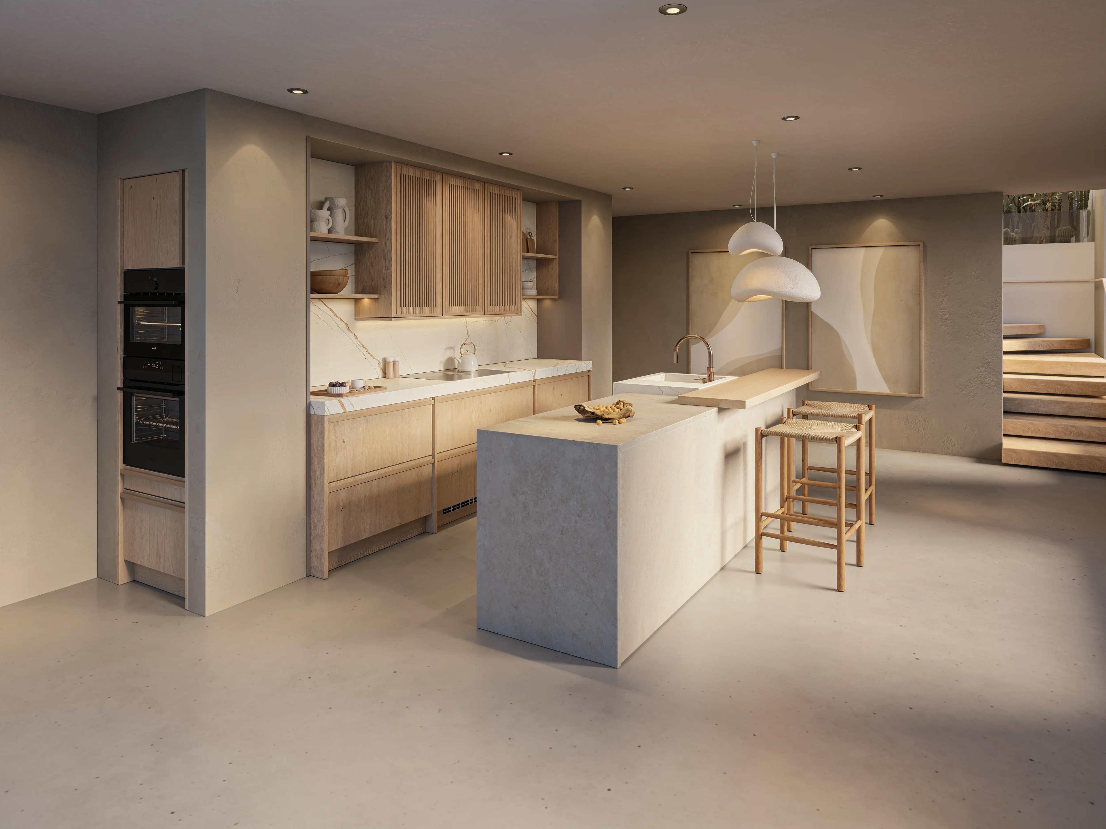
Kitchens in natural tones: from sand to taupe
A kitchen in natural tones has a calm, warm feel. Think soft sand colors, beige, greige, and taupe, combined with wood or a beautiful stone countertop. Discover which natural tones suit your kitchen and how you can combine them.

Calm colors with a warm feel
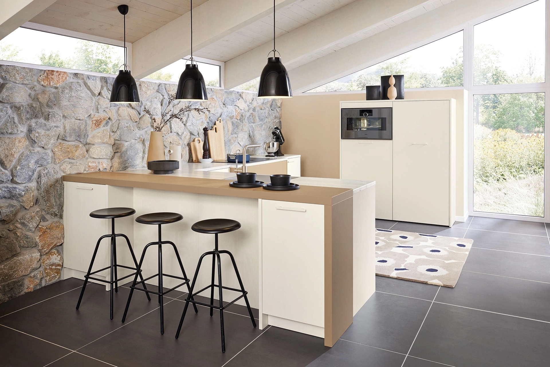
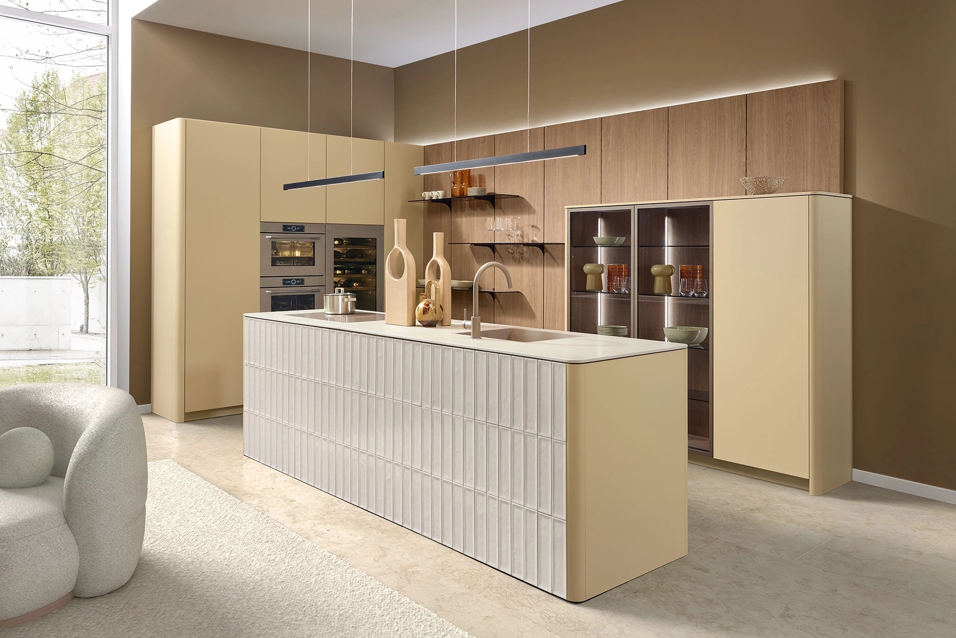
Natural tones are less bold than, say, green or blue, but they do add more color to a kitchen than white or light gray. Sand, beige, greige, and taupe are particularly popular choices. These colors complement various kitchen styles, from modern and minimalist to rustic. You can design all kitchen cabinet fronts in the same shade, or combine different colors. Consider a sand-colored cabinet wall with a taupe-colored kitchen island, or beige base cabinets with wooden upper cabinets. By working with light and dark shades, you can create more contrast without using bold colors.
Which natural tones work well in the kitchen?
Beige is a popular choice, but there are many more natural tones suitable for kitchen cabinet fronts. Sand is light and soft, while greige is a combination of gray and beige. Taupe often has a slightly deeper, grayish undertone, and clay tones can appear a bit warmer or more earthy. The difference between these colors is sometimes subtle. For example, a beige cabinet with a yellow undertone looks different from a beige shade with more gray in it. The floor and the color of the walls also influence how a natural shade comes across. That’s why it’s a good idea to compare different color samples side by side.
Combining natural tones with wood
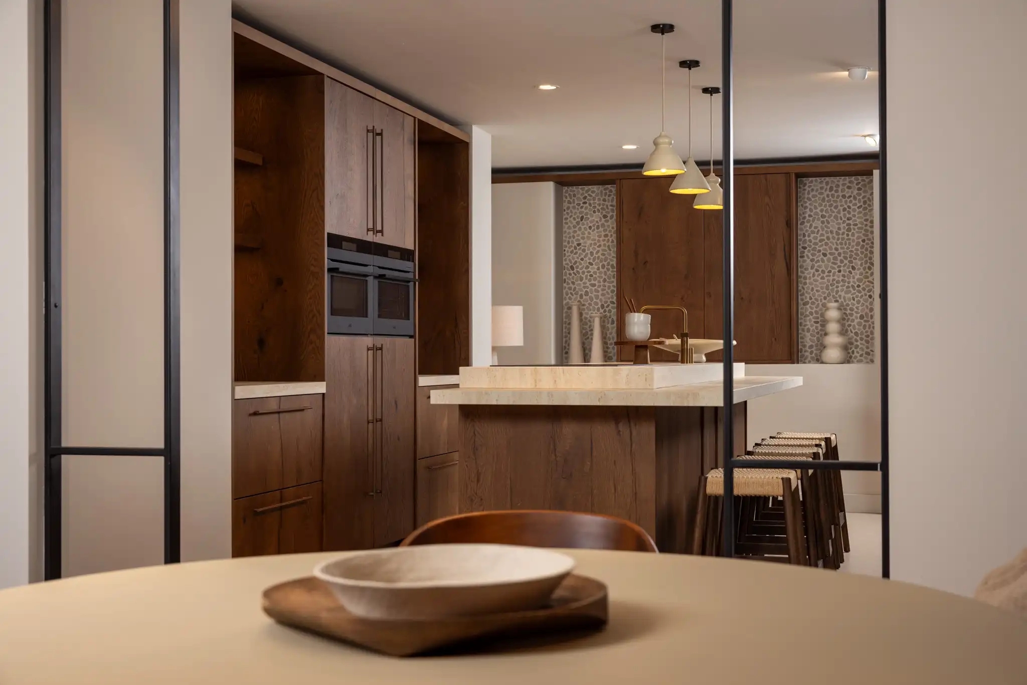
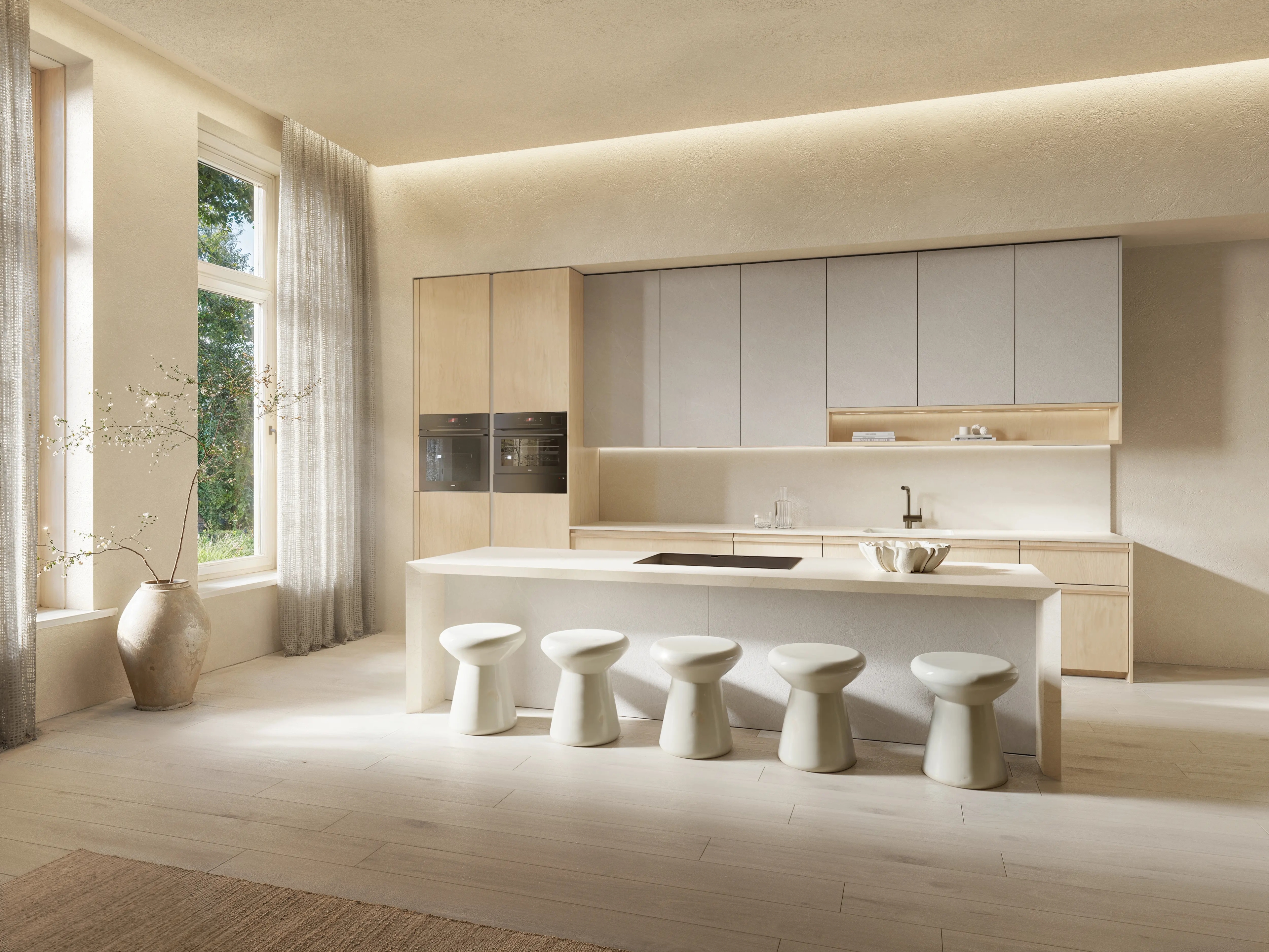
Wood pairs well with kitchens in natural tones. Light oak combines beautifully with sand-colored and beige cabinet fronts, while dark walnut or smoked oak provides more contrast. Visible wood grain also makes a difference when paired with a solid-colored cabinet front. You don’t have to finish the entire kitchen in wood. A wooden cabinet wall next to a beige kitchen island can be enough. An open cabinet, niche, or bar countertop is also a great place to incorporate wood. The wood color you choose depends, among other things, on the undertones of the kitchen cabinet fronts and the floor.
Which countertop goes well with a kitchen in natural tones?
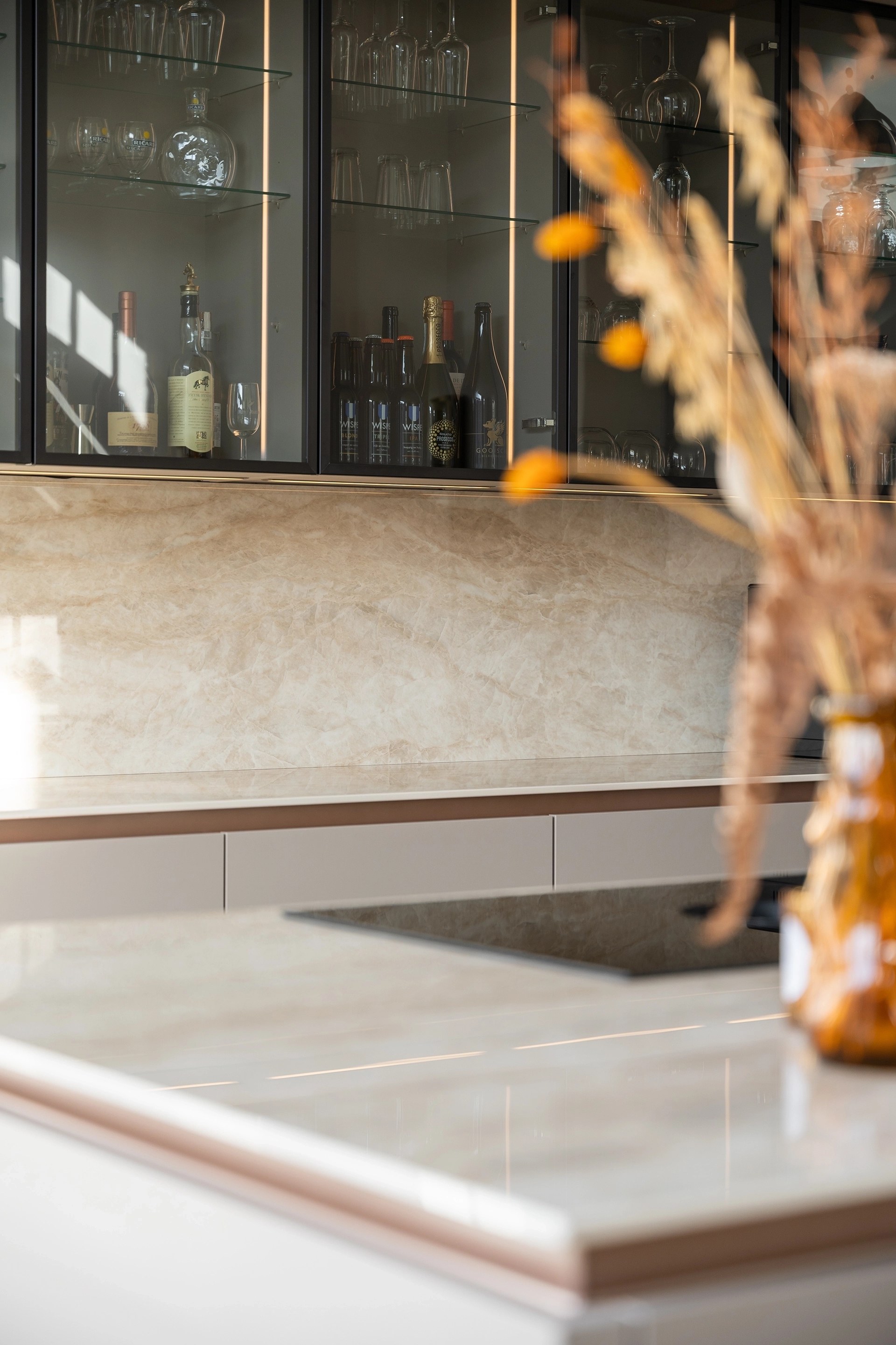
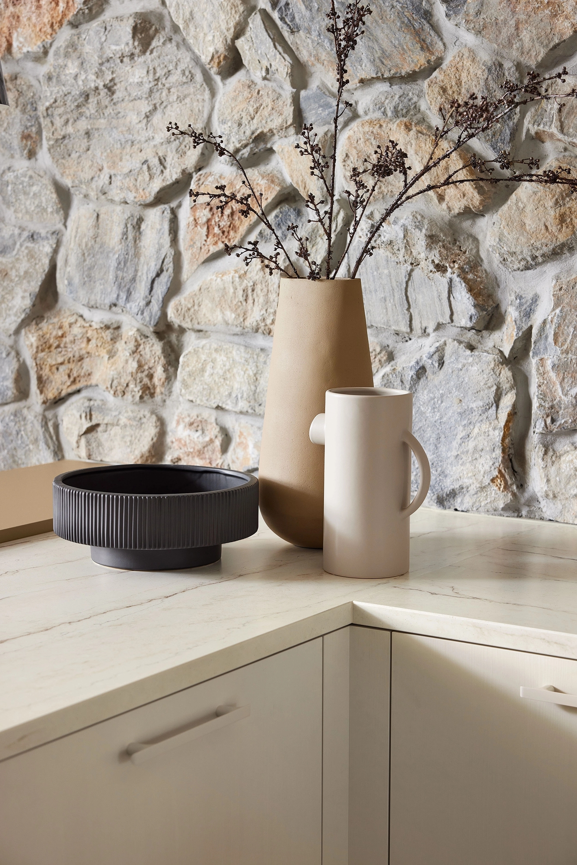
Various types of countertops work well with beige, sand-colored, and taupe kitchens. A light-colored countertop in a similar shade minimizes the color contrast. A dark countertop, on the other hand, creates more contrast—for example, with light beige cabinet fronts. A countertop with a stone texture can also look beautiful. Consider a subtle limestone look, a sand-colored ceramic slab, or a marble-look surface with subtle veining. Pay special attention to the material’s undertone. A cool-gray countertop paired with a warm beige cabinet door can look very different from one with a soft cream color. In addition to color, the material’s intended use also plays a role. Ceramic, composite, and natural stone have different properties and do not all require the same maintenance.
Natural tones in a Japandi kitchen
Japandi kitchens often feature light woods, simple cabinet fronts, and muted colors. Natural tones complement this style perfectly. A kitchen with sand-colored cabinet fronts, a light oak cabinet wall, and a countertop with a soft stone look is a great example. Greige and taupe can also work well with this style, especially when paired with wood and matte finishes. By keeping the colors close together and avoiding too many different materials, the kitchen’s clean lines remain clearly visible. On our page about Japandi kitchens, you’ll find more inspiration for colors, materials, and designs that suit this style.
Light and natural tones in the kitchen
The amount of natural light has a significant impact on how natural tones appear. A beige kitchen may look different in the morning light than it does at the end of the day. The room’s orientation also plays a role. For example, in a kitchen with little direct sunlight, a color may appear grayer than you’d expect based on a color swatch. Artificial lighting also has an effect. Warm white lighting can enhance the warm undertones of beige or sand, while cooler light makes the color appear different. Therefore, don’t just look at the cabinet color—also place it next to the countertop, the floor, and any wood samples.
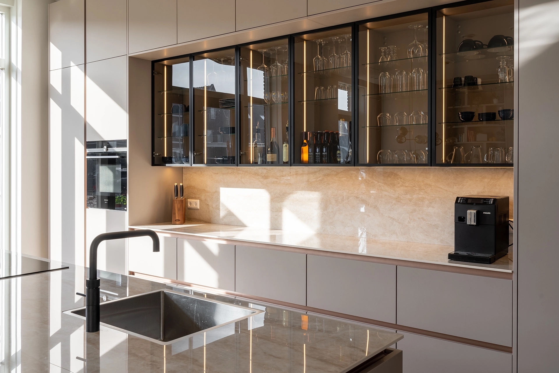
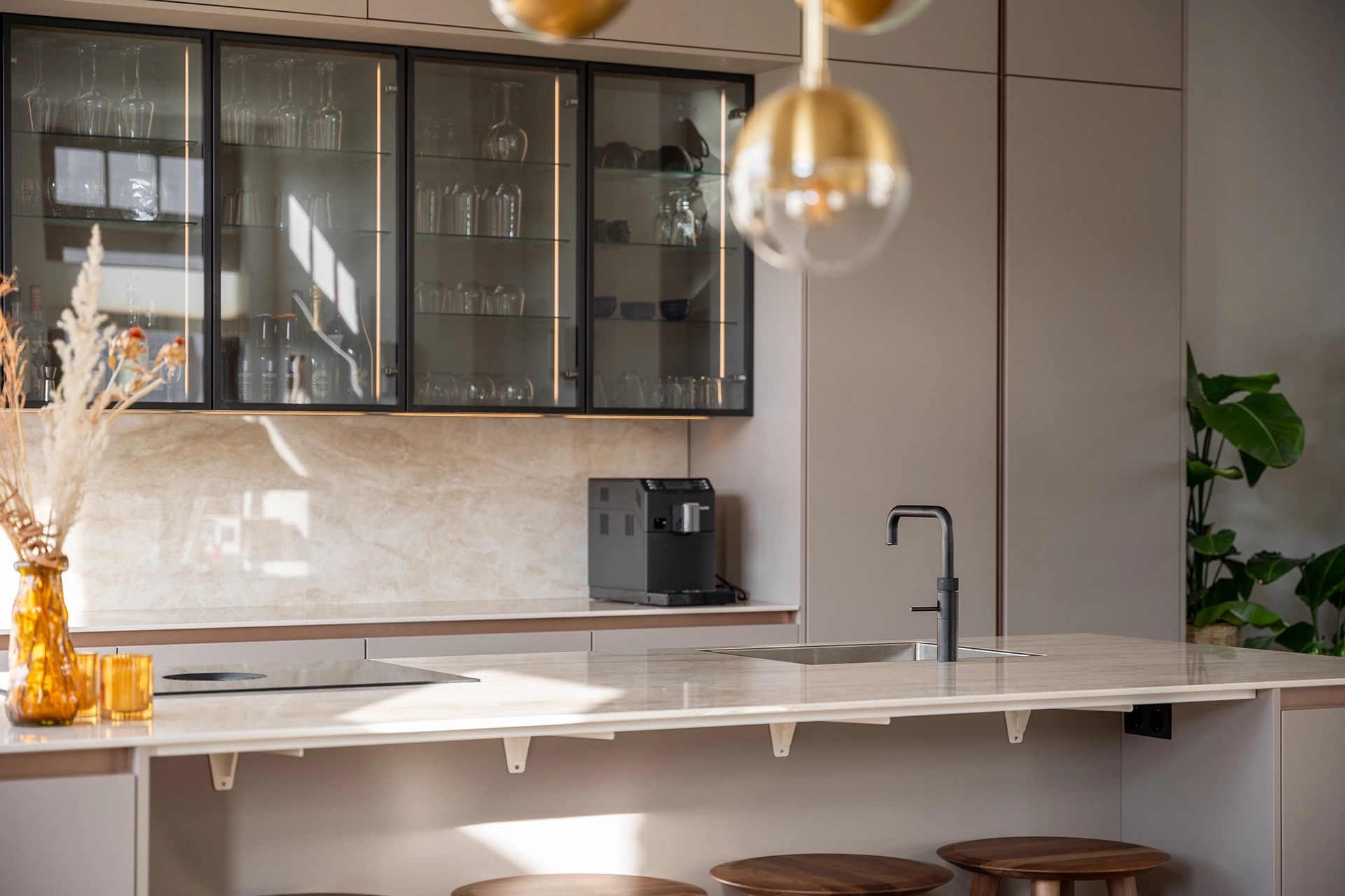
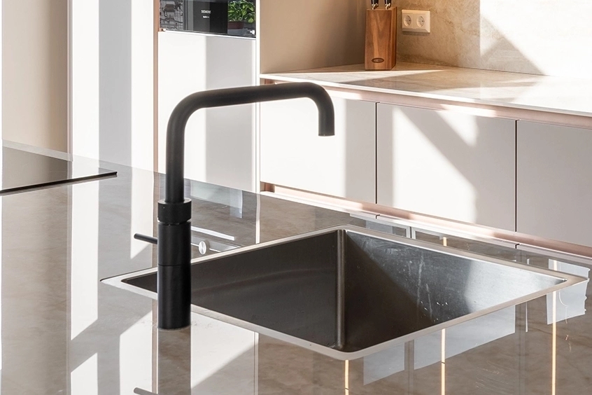
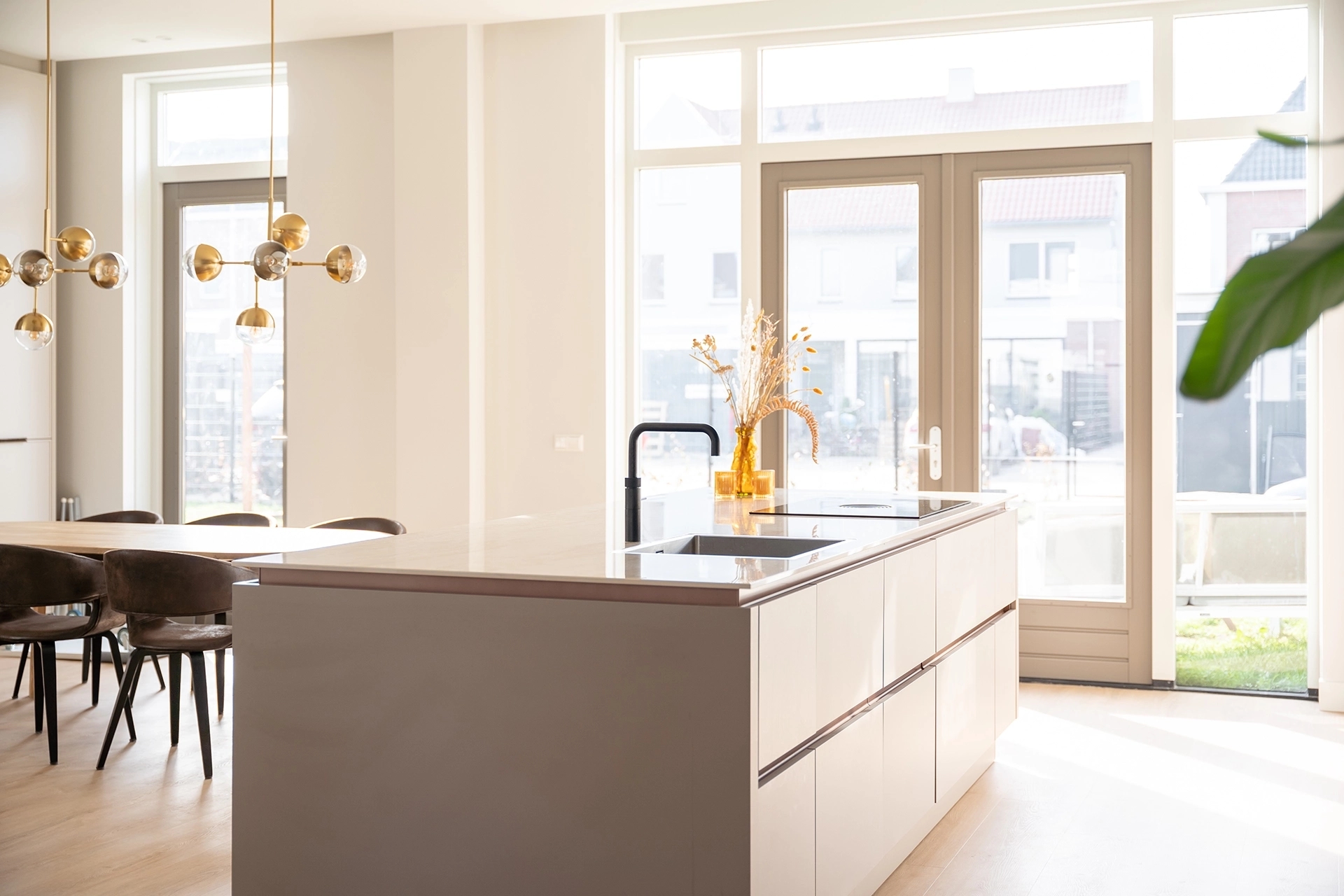
A warm color tone, bronze details, and a spacious kitchen island. In this Keller kitchen in Weesp, you can see how the color “Clay” is combined with various materials. Take a look inside this kitchen and get inspired.
Curious about the rest of this kitchen? Check out the photos and discover how the cooking island, colors, and materials are combined.
View a kitchen in natural tones at Intermat
You often don’t really see the difference between beige, sand, and greige until you compare the colors side by side. In our showrooms in Mijdrecht and Alphen aan den Rijn, you can view various kitchen cabinet fronts, wood types, and countertops.
Our kitchen consultants will be happy to help you choose a natural shade and the materials that go with it.